Wednesday, 19 November 2014

Tom Hoops Photographer


These are Tom Hoops photos. Taken on location Tom has an range of water shots in colour & black'n'white full body photos. 
Clear focus & use of low depth bring out a HD feel as well as the subjects structures. They are beautifully taken with either a landscape or square genre. I find Toms pictures attention grabbing, I like them.

Diane Arbus Photographer

No photos available.

Dianes photos are black'n'white with sometimes an underexposed background.  Her main focus is people though more on carnival folks taken on location. She uses low depth aperture in some of her photos making some key points much clearer.  I personally might not like many of her photos non other the less they are well taken & some do give off an intriguing fibe.

Julia margaret Cameron Photographer


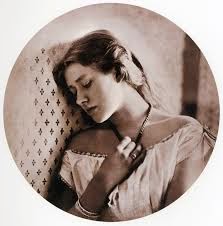
These are Julia Camerons photos. Vintage portraits with an aged theme & central composition of the subjects. They were taken on location with different exposure backgrounds. The subjects ranged from youth to elderly & each in a different location situation with either having eye content to the camera or gazing away from the camera & some with closed eyes. The fibes portrayed from these photos are quite negative. Although these shots were taken lovely they're not my cuppa tea but there are beautiful.

Tuesday, 18 November 2014

Ansell Adams Photographer


These are Ansell Adams photos. Ansell has used the 'rules of Thirds' composition for his shots, the black'n'white landscapes give out a calming fibe & has an elegance to them. The nature themed photos are beautifully taken with a clear looking stillness that makes me think Ansell maybe used a tripod to help capture the freshness of the scenes. I like these photos very much as they shop you natures beauty professionally.

Charlie Waite Photographer


These are Charlie Waite photos. Taken on location using the 'rule of Thirds' Charlies shots are a variety of landscapes.  The clear focus brings out the colours & details in the photo that almost makes you think that you are also there taking the pictures. I think Charlies photos are beautiful & make me wish I was there too.

Monday, 17 November 2014

Ted Vancleave Photographer


These are Ted Vancleaves photos.  As shown Ted takes his shots on location & in colour. His landscape style photos go from a arrange from background composition buildings to marco pictures of wildlife. I think that for what I can see Ted doesn't use the 'rule of Thirds' guide in his photos but dispite that I like his photos & believe they are well taken. Especially his caterpillar & lizard shots. The low in deph really shows how soft the texture of the caterpillar might be & the clearness of the lizard shows lovely detail.

David Bailey Photographer


These are David Baileys Photos. As one can see David prefers black'n'white shots with the subject in central composition though there are some photos that the subject is to the side view. David uses the following genre stlyes for his shots such as landscape, portrait & even square. He also mixes exposures in his shots as some the background is overexposed & the subject underexposed but that is when the shots take place in the studio when it's in location the exposure is reverse.  I like Davids work as it shows beauty & grace for all his subjects.

Neville Brody Graphic designer


These are Neville Brodys pieces. Neville uses different styles from detailed black'n'white to basic fun multi coloured.  Though even in the detailed pieces regular shapes & patterns are shown they still manage to tie the work together. It's interesting that he can have two different types of art style & make both look great despite the differences in characteristics. Most artists stick to one type of style but Neville like Stefan Sagmesiter go for ranges of styles & still bring out that positive art vibe. They are quite successful in my eyes & I can see why people would us he's designs.

Sunday, 16 November 2014

Stefan Sagmesiter Graphic designer


These are Stefan Sagmesiter Graphic pieces. Using different materials Stefan has created many types of art both with nature & man made themes. With only a limited colour palette & basic shapes Stefan still manages to bring a creative fibe to the art.  I like his art with it's out the box ideas & is basic layouts.