Friday 27 February 2015

Typography: I'm Alive Lyrics Art

The Guardian has ask us to create typography pieces of two different styles using lyrics from songs we find inspirational to us. My first typography piece is a random chaotic style that has a jumble effect that is pleasing to the eyes of some, others may find it a mess but like the technique as it's different from the normal neat style. My second piece it much more simple and has a charming effect as the lyrics have been put in shapes this time making it a complete opposite to the first, they both contrast each other in a positive way has they highlight their strengths more then their weakness.
My typography lyric art pieces.
Using the song lyrics of I'm Alive by Becca to create my pieces with a little of Celine Dion I'm Alive lyrics also in the first piece but not the second.


Illustrator was used to create my Lyric pieces, I am pleased that I managed to use illustrator with few hiccups and finish my final pieces the way I had visioned.

The first piece is a combination of I'm Alive by Becca and I'm Alive by Celine Dion lyrics, we had to pick a song, I'm Alive by Becca, that emotional inspired us and create a typography piece with those lyrics. I also choose Celine Dion's song to be the middle section and break up Becca's so it wouldn't be so much repeating. I did a 'random' pattern typography of overlapping with font style Rosewood and put different sections in different colours in a sort of flag style with title in black coming across the page repeatedly in big letters.
I believe the piece to be a success as it's what I had in mind, the colours go well with each other and the Title gives it a professional finish. Neville Brody was the inspiration for my first piece, his style of graphics can go from black and white simple to fun multi colours with a stylish jumble of words and images. I've managed do create my own style version of he's creativity without a complete take over.

My second typography piece is an opposite to the first as that is a random overlap and this is a simple word image style with only one colour to living it up and the font style Curtz MT. I thought it would be a great contrast with the lyrics of only I'm Alive by Becca in shapes of flowers, the lyrics are of dark psychology were as flowers are associated with life and spring.
I'm happy with the results, I managed to give it that certain cute charm despite what the lyrics say producing a warped abstract theme. I believe this piece is also a success.
The typographer who inspired this piece was Ms Kate Moross, her jazzy, un-beat creations had me thinking of creating one my version as the lyrics would be a fantastic contrast to the image of flowers. Though Kate Moross uses bold, multi-colour schemes I decided to do the opposite and go for a black and white theme that brought the piece together very well.


Photography: Masks 4 Photoshop

I've kept my 9 final photos real by not photoshopping them and keeping that natural look with background and all.
Although this post will be about photoshop, seeing the difference between natural and staged.
I must admit that there are some photoshop style done photos that I see as an improvement to the natural giving it more feel to the viewer.

 First off I cropped the photo to portrait that would give it a closer fit to the face, while it also got rid of the extra background showing only a pure black drop look.


 Once nicely cropped I level it slightly to make the back drop more intense black and the little white cleaner. I like the cropped look as it brings more focus on the masks and model highlighting them almost professional plus it looks tidier.
To level the picture go to layer then new adjustment layer then Levels... which will bring up the levels panel that will help you adjust the exposure levels to how you want by moving the little arrows on the wave chart (as show in picture).


 My first filter change was making the image black and white. Again layer, new adjustment layer then black and white...
I love the black and white adjustment to this photo as it brings more mystery and even a bit of sophistication to the theme.


I now move on to filters: they can bring a slight or bold tint to the image depending on what density you set it at. Layer, New Adjustment Layer then Filter....
This is a Warming Filter (LBA) with the density of 25%. The tint does seem to give her a healthier, warm glow to the skin making it more real vibe to the viewer. I like this warm filter, it bring out her youth more and just seems to intensify the masquerade theme successfully.


Cooling Filter (80) with the density of 63%.
This cooling filter gives the affect of chilling silence, the tint blends well with the white mask adding successful to the masquerade theme with a hint of ice queen beauty. I like this filter, it gives positive results and still manages to maintain its natural feel.


Red Filter with the density of 73%.
Although it not longer has the natural feel, the mars like sand shades deepen her skin tones nicely. The red filter tints well with the white mask. For some reason when I look at the image with the red filter I see a professional feel to it. Earthy tints suit the white mask and the model's complexion successfully and I would gladly do a second piece with the edited photos.


Green Filter with the density of 60%.
The green tints well with the white mask, though I can't be 100% certain if the contrast between the model's complexion and the green filter is a good comparison. Despite that, I still think it works but it would need to be in a grid style frame with 3 others of different shades of green to structure it better.


Violet Filter with the density of 60%.
Though the tints goes well with the white mask it doesn't go well with the model's complexion.
I don't think this is quite successful like the others above but it does have a certain charm about it, like it still gives of warm vibes despite purple being a cold colour. I think violet is a bit warmer to the original shade, I like this photo change and would use it.


Sepia Filter with the density of 99%.
The filter I believe is very successful with both the white mask and the model's complexion as it gives an earthy yet vintage feel to it that complements the eyes. The brownish blush tones the skin richly and gives it a professional finish in my view. I am very pleased with the results and would certainly use the image with the other earthy tints.


Underwater Filter with the density of 77%.
Tints the white mask well, slightly changing the colour to a light blue giving the mask a mystical look than a mystery vibe. Despite the high density the filter still manages to give it a hint of a natural look and contrast the model's complexion nicely. Like the green filter this would also be more successful with other images with a blueish tint, unlike the cooling filter that gave it an ice queen beauty this filter has a more sea-foam colour that makes you think sea fairy then ice queen. I do like this filter and would use it again as well as the image.


Monday 23 February 2015

Typography: Font Choices, Take ya pick...

Font choices: I'll admit although I didn't use most of them (mainly cause I didn't know about them) I like these types more: American Typewriter, Blackmoor LET Plain:2.0, Brush Script MT Italic Jazz LET Plain:1.0, Rosewood Std and Zapfino.


Choosing a font can either be easy or hard depending on if your picky, so have a sheet (like the on above) that shows you the different font so you can save time and pick your font this way.
For my first typography piece the font style I used was Rosewood STD, very nice looking, gives a sort of 3D effect that I thought gave my 1st piece a professional (in my opinion) finish.
The 2nd typography piece I gave it a playful, laid back vibe that i think I achieved by using the font style Curlz MT, curly, cute and mildly simple. 
The red writing in the bottom right hand corner saids it all about my opinion on choosing a font:
"If I had to use any of the font 
choices it would be because either 
the font fitted the project well or because 
I just liked it.  Honest Truth :)"

Friday 13 February 2015

Photography: Masks 3 Finalists

We have come to the finalists, photos that are the complete assessment and will evaluated by the Guardian.

Here they are all 9:


I believe these are fit to be finalists as they are in wonderful focus and the clear imagery show off the masks designs and their angles. They are kept in colour as they give more emotion to the theme then black'n'white could have it makes them more real to the viewer. Their compositions are different so they aren't all similar but kept to the genre theme, the angles help highlight the masks well and give them a professional look. I am very pleased with these photos and are happy with them as they are what i wanted. To me they are a success.  However, I do acknowledge that I have artefacts in the background other than the studio background.  I like this as it makes it seem real and not too staged.

The Photographer that I used to inspire my photography project is Mr Tom Hoops. His main work consists of black and white close up portraits. (See my post about Tom Hoops the Photographer). His work is highly stylised and he often crops the face to reveal a mysterious look.

I liked the idea of the masks close up and in detailed focus like Tom did for his photos bringing a slight similarity between the themes. Though Tom photos are more about the peoples faces and expressions where as mine are focused around the masks, however the models do bring more depth to the photos then the masks could on their own without props. Although I find his work inspiring I have put my own slant on it rather that copying it.  I am really pleased with my results and feel they have a similar quality to his work.

There is another photographer who inspired my work with facial and eye direction, Ms Julia.M.Cameron. With her expressional shots of people in a portrait style with a black and white tone you see the emotion they draw through with their eyes. Either staring directly at the camera or gazing out into the distance (as see in my post of her), I wanted that for my photos by changing the models gaze direction and face turning so they didn't look like dolls but people that had thoughts to give. Although Ms Julia has toned her photos black and white I felt that for this reality/colour out weighted vintage in the decision.  Here are some of Ms Julia's photos for you to see for yourself.

 This subject has her eyes closed and head tiled giving the emotion of sadness through her expression. Ms Julia used a vintage camera for her work that gave charming results for all her photos. This facial placement inspired me as her 'pouting chin' looked beautiful and brought her to life in a way instead of making her to be a doll like some now a days models are portrayed to be. Inspired photo no: 6.


The subject has her hands in focal view near her face which I also though added more structure to the photo as well as strengthened her expression on thought. This photo brings youth to the viewer with her youth looks yet serious gaze. Inspired photo no: 4.

Her gaze upwards with concern shining through this vintage looking photo brings one to wonder about ones life as viewing this photo you wonder why nearly all of Ms Julia's photos show detached emotions but beautiful expressions. Inspired photo no: 5.

In 1863, when Cameron was 48 years old, her daughter gave her a camera as a present, thereby starting her career as a photographer. Within a year, Cameron became a member of the Photographic Societies of London and Scotland. She remained a member of the Photographic Society, London, until her death. In her photography, Cameron strove to capture beauty. She wrote "I longed to arrest all the beauty that came before me and at the length the longing has been satisfied." The basic techniques of soft-focus "fancy portraits", which she later developed, were taught to her by David Wilkie Wynfield. In photography, soft focus is a lens flaw, in which the lens forms images that are blurred due to spherical aberration. A soft focus deliberately introduces spherical aberration in order to give the appearance of blurring the image while retaining sharp edges; it is not the same as out-of-focus image, and the effect cannot be achieved simply by defocusing a sharp lens.


Photography: Masks 2 with Models

Continuing the mask gallery we have used four beautiful models to wear the masks to give a different view to the assessment.

Using lighting we created a half shadowed effect that brings out the mystery/opera feel that is portrayed when the masks are worn. I'll admit it was hard photographing the models as I know they were unsure and I didn't have the heart to boss them around as for two reasons 1. They are my classmates and 2. I didn't have the background or props I wanted (they would have been hard to find and bring in really) to really show them off but I made do with what I had and I did get some great results.
I tried to shoot from different sides to see what results I would get, some successful others unfortunately not. Though I am pleased with many of my photos and I thank the models for that.
Here are some photos for you to see:


Directing them to not always look at the digital camera (nikon d40) directly gave the photos a different outlook to the them. Increasing the mystery feel as well as adding to it a fashionable theme that gives them a positive change and shows the wide range of themes masks can produce to the viewer. Again not sticking to just central position I tried to catch them looking away or shift it to the side a bit to get a fuller look at the different angles. Taken in college studio I also used a black background again for the models as I do think that the black makes them look more professional then the white would have. There really isn't a colour palette as the colours used are of course natural and I think would suit better then putting them in black'n'white as it gives the theme more life then colourless tones. The black highlights both the masks and models while I think the white would have washed them out.
Although the background I really wanted was one of a cafe at night and the props would have been a slim table with chairs that they all would have sat around and I'd photograph them that way at different angles and closeness.
Though these do give good results and some will be use for final pieces.
I especially love the second to last photo of the white mask, the angle is beautiful and makes the mask have a stronger appeal. The pink masks I also think are appealing more as the hand positions with the black nail polish contrast wonderfully with the mask and theme.
The final photos will be on a different page also.
Photography: Masks 3 Finalists.


Photography: Masks

The Guardian had asked us to do a photography assessment with the subject Youth Culture.
Youth culture can really be about anything related to shared likes, hobbies, interests and more between the youth.
The Youth Culture theme I choose to photograph was masks as they have many meanings like:
Masquerade/Mystery
Romance/Opera
Halloween/New Identity
Youth/Fashion

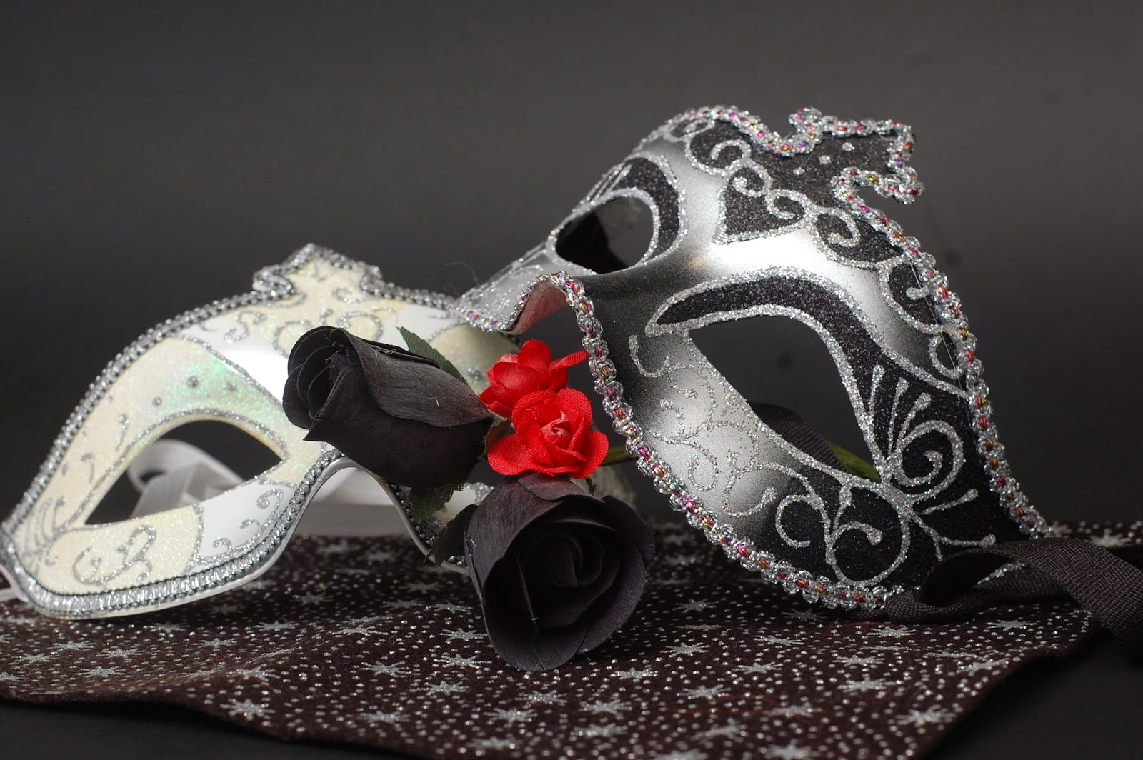
I experimented with the masks on their own first with a few props and at different angles to show off the different sides of the masks with their elegant designs. I tried to give it a romantic/mystery theme to the masks with a star print fabric piece for the masks to lay on with fake fabric roses of two different colours and sizes to be placed with the masks.
Also changing the masks positions and doing close ups at times continued to bring good results as well as replacing the rose props to see how many looks I could get from them.
To my believe with the masks on their own at first with the right props it was successful and I love some of the results from the mask photos.
Here are a couple photos for you to see:


 Using a digital camera gave me choices as I could upload them on the computer and view them in HD so I can see if the focus point worked and I would have clear images. They were taken in the college studio with a black paper background, I though black would be better suited for the masks as it in my opinion just highlights the masks more professionally making them more stronger then a white background would and it helped blend the fabric I used. I tried not to only have the masks fully in central composition so I tried photographing them so some would be a little higher or more to the side then just keeping in it the middle all the time and it gave great results showing off their angles in different compositions. There is a limited colour palette I used by combining the black'n'white palette with only a dash of red with the mini fake roses which give a great contrast to the photos.
I am very pleased with the results and the photos are what I wanted so to me they are a success.
There will be more mask photos but with models, they will be on a page of their own.
Photography: Masks 2 with Models.