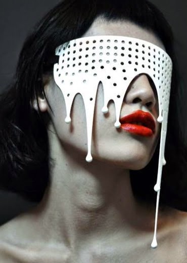
Many where beautiful and joyful, there where those of horror and fearfulness, all had their uniqueness to them.
Some photos had bright lighting that made the masks glow nicely depending on its colour, but the flaw was that it washed out the model making her seem doll like that I don't want in my photos so maybe have a half shadow lighting would be best for the photos so it can complement both the mask and model.
The other strong point that caught my eye was that the models gaze was else where than directly at the camera, which is fine sometimes though the different gaze directions just seemed to bring more of an emotional flow through the image from friendly to serious thought.
Tilting the head of the model managed to showed off the mask a bit more professionally and strengthen the models features more. This highlighted the more mystery, stylish theme of the themes that I want to have shown in my photos.


No comments:
Post a Comment