

The style is call random overlap, it's a slow process but the end result is amazing (as reveiled throw out the scene shots). I chose to have the text in colours and the first is my favorite colour red. The font is rosewood and I happened to come across it by the title as it sounded pretty and the affect of the font was great as it gave a vintage look to an abstract typography piece.


You keep building up the words, there is no real limit to random overlap it's more of the persons view point. The second colour I chose was green as I thought it worked well with the red.
This process was working well as there really isn't a wrong way but i'll admit there was a time or two that had me frustrated as I kept losing where I had placed the words or which words I had done, having it in colour was a better option than black as the colour made it easier to see against the white back ground. As black would have blended together too much making it look like a black blob than a type scramble.


After quite the build up of words I test the title to see how it would wrap up and realised a third column was needed for it to be completed, so I put the title letters to one side and started the third column.
Green was another easy to see choice and it was luck that made it compatible with the red, the hard part was thinking of another colour that would suit the others but would be easy to see against the white background. After all there was shades to consider, lighter or darker, then there was the fuss about not having enough lyrics so it wouldn't look like too much of a repeat. I had to think of the best path to take as I didn't want to change the placement or style but I did find the compatible colour.


Colour choice for this column was blue which suited the other two nicely without being harsh on the contrast. I realised the columns formed a sort of flag look that just fitted the random theme because lets be honest flags were random at first too. The solution to the lyrics problem was that I found another song that had the same title as the first so the concept would be the same even if the lyrics meanings were different. It was hard at first using different lyrics has I had almost mesmerised the first set so I pasted the song onto the side so I didn't have to kept going back and forth on websites.
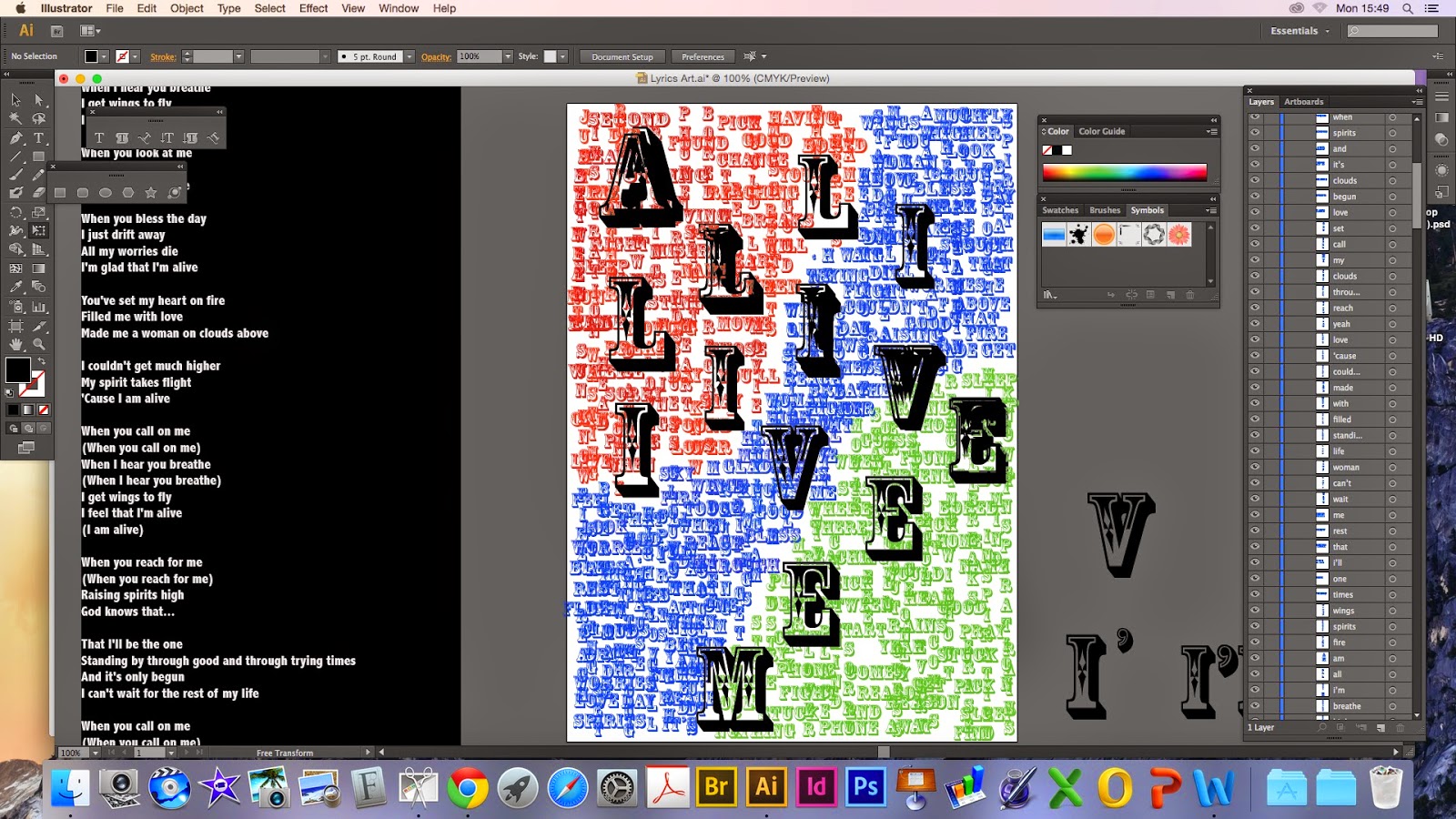
I thought a good finish would be having the title in bigger, bolder letters and going across the page in a repeat for a kind of professional/hypnotic affect which I believe to have been a success. At first though I had problems with the right size of the letters, thinking is this too big or too small but luckily I did settle on a size that did turn out quite nice. Than trying to have them in almost perfect lining which I almost gave up on as the Guardian did complain that they didn't look straight a few times but with patience it was manageable and I got them in line that gave the results I wanted and suited the rest of the piece.
I am very pleased with my choice to do the random style as it gave better results than I would have imagined.
No comments:
Post a Comment